FIXING ACECORE’S ONBOARDING UX
The Acecore app is a sophisticated mobile application meticulously crafted for seamless interaction between users and their solar inverters. Its primary objective is to empower users with comprehensive control, intuitive navigation, real-time monitoring, and in-depth analysis of crucial data and updates associated with their solar energy systems. By leveraging the Acecore app, users gain the ability to effortlessly optimize and harness the full potential of their solar inverters while staying informed about its performance and making data-driven decisions for enhanced energy efficiency.
OVERVIEW
Our cohesive team of two revamped a solar-powered inverter app, focusing on enhancing onboarding, optimizing UX, revitalizing UI, and organizing features hierarchically. The result is a seamlessly integrated product that delivers an elevated experience for solar energy users.
ROLE
Ux designer
DURATION
The project was completed in one month and six days. Productive stakeholder meetings lasted around one week, initial ideation took five days, and the iterative process and reviews spanned two weeks to refine and optimize every aspect.
PLATFORM
Android and windows OS platform/ devices
RESPONSIBILITIES
UX Research, Content Strategist, UX Design, Information Architecture, Product Design, Product Thinking, Interaction, Visual Design, Prototyping, and Testing.
TEAM
2 Stakeholders , 2 Product Designers, and 1 Developers
THE POWERCELL PRODUCT
THE PROBLEM BEFORE I WAS BROUGHT IN
The Acecore product aimed to revolutionize energy consumption with long-lasting, rechargeable power cells powered by solar panels. A mobile app was developed to provide users with control, comprehensive information analysis, and real-time monitoring. However, the stakeholders mentioned that the initial app version disappointed users due to: poor onboarding, a lackluster UI, and A perceived complexity that led to customer disengagement.
WERE THE STAKEHOLDER WRONG?
Prior to delving into the design canvas, I recognized the importance of conducting a thorough analysis and validation of the stakeholders' perspectives. My objective was to assess the extent of the onboarding flow issues, deficiencies in the UI, and the overall negative user experience associated with the app. By conducting this evaluation, I aimed to pinpoint specific areas that demanded improvement, thus providing a solid foundation for enhancing the app's usability, visual appeal, and overall user satisfaction.
WE REVIEWED THE FEATURES
In collaboration with my teammate, we diligently gathered and documented the areas and features that the stakeholders expressed as needing improvement. To ensure a comprehensive understanding and effective communication, we scheduled a four-hour meeting solely dedicated to thoroughly discussing and capturing these features, addressing each point in detail
VOTING/ SORTING OUT THE FEATURES
Following in-depth conversations, my teammate and I transitioned into a focused and diligent work mode. We meticulously recorded the essential and non-essential features discussed by the stakeholders during the previous meeting on a dedicated canvas. Our primary goal was to prioritize and evaluate the features and systems that held the highest significance in the eyes of the stakeholders. Through a voting process, we aimed to ascertain the topmost important elements to guide our subsequent design decisions and ensure alignment with the stakeholders' expectations.
VOTING/SORTING SYSTEM
In order to determine the essential components of the onboarding app flow redesign, my roommate and I implemented a voting system. Individually, we cast our votes on separate canvases, selecting the systems or features that we believed must be incorporated. To ensure a robust selection, we established a rule: any feature that received votes from both of us would be deemed crucial and given the highest priority in the redesign process. This method allowed us to collaboratively identify and prioritize the most significant elements that warranted inclusion in the revamped onboarding experience
THE IMPORTANT FEATURES
Once the voting process concluded and we sorted the features deemed important for both the stakeholders and the new onboarding flow redesign, we proceeded to visually organize them on a plain canvas. This visual representation allowed us to gain a comprehensive overview and better understand the relationship and arrangement of the selected features
WE FACED A LIMITATION
We firmly believed that design should always prioritize the needs and preferences of the users. With this principle in mind, we approached the stakeholders, requesting direct access to the product's primary users to gain invaluable insights. Unfortunately, they declined our request, citing reasons best known to them. Understanding the unique challenges faced by a small startup like theirs, I recognized the importance of finding alternative avenues to effectively understand the users and tailor the design accordingly.
WHY WE NEEDED ACCESS
To conduct a comprehensive research study on the usage of the power cell, it was imperative for us to have direct access to the users. Our intention was to delve into their operational methods, interactions, and discern their preferences and dislikes. This extensive research would enable us to identify the features that the users genuinely desired in the mobile app. Regrettably, despite recognizing the significance of this access, we encountered a setback as our request was denied, thereby necessitating alternative approaches to gather valuable insights.
WE IMPROVISED ON RESEARCH
In order to effectively accomplish our research objectives, we recognized the importance of flexibility and innovation. We employed various innovative methods and approaches to comprehensively comprehend the needs and desires of our users. By adopting this adaptable approach, we ensured that our research efforts were dynamic and responsive, enabling us to gather comprehensive insights that would inform our design decisions and meet the expectations of our users.
HOW DID WE ACCOMPLISH RESEARCH
In order to develop a design solution that effectively caters to the needs of our users, we undertook a thorough research process. This involved conducting in-depth investigations of similar products available online, carefully analyzing their onboarding flows, user feedback, pain points, and design features. By immersing ourselves in this comprehensive exploration, we gained valuable insights that informed our redesign, enabling us to create an efficient and user-centric solution
SORTING OUT RESEARCH INSIGHT
Once the quantitative analysis and research were concluded, our next step was to prioritize the most crucial findings or insights. To accomplish this, we gathered all the insights onto a blank canvas, making them ready for sorting according to their relative significance.
WE VOTED ON THE IMPORTANT FEATURES
To determine the order of importance for the systems, features, and designs in the app redesign, my teammate and I implemented a voting mechanism. Our primary aim was to identify the critical aspects that demanded immediate attention. We placed significance on features that garnered at least two votes, ensuring a consensus among our team members. To ensure a comprehensive evaluation, we individually cast our votes, resulting in the categorization of prioritized features on a dedicated canvas within a separate section. This visual approach allowed us to conduct a meticulous analysis, carefully assessing and scrutinizing the features in a well-structured and visually appealing manner.
PREPARING TO IDEATE
Prior to initiating the ideation phase, it was essential for us to engage in thorough preparation. To achieve this, my team mate and I meticulously organized the insights we had accumulated from various sources, such as stakeholder recommendations, brainstorming sessions, and online analysis research. Once all the valuable insights were gathered, we proceeded to group them based on their similarities. This approach ensured that we could avoid duplicating ideation efforts for specific features, resulting in a more efficient and focused process.
HOW MIGHT WE
This particular section revolved around the formulation of "How might we" statements. After consolidating all the insights on a plain canvas, our objective was to craft a problem statement. The purpose of this problem statement was to provide a clear direction for our ideation and solution development process. To address each individual insight effectively, we generated a corresponding "How might we" statement, allowing us to approach the problem-solving process with a proactive mindset.
SOLUTION/IDEATION
At this stage, we were prepared to devise solutions and generate innovative ideas to make the insights, new features, and flows valuable for our users. For each "how might we" statement, we formulated written solutions and brainstormed ideas to enhance them further.
USER FLOW AND INFORMATION ARCHITECTURE
Upon finalizing the written solutions for each feature and page, our attention turned towards mapping out the interactions between them. It was crucial for us to meticulously design the flow of the mobile app, ensuring that all essential information was thoughtfully organized and presented in a cohesive manner.
INSPIRATION BOARD
Subsequently, our focus shifted towards the creation of mood and inspiration boards. These boards were developed for each "How might we" statement and its corresponding solution. The primary goal of these boards was to ignite our imagination and encourage creative thinking, leading us to craft visually stunning and functionally efficient UI designs that perfectly reflected the company's brand identity and core values. Each mood board provided us with a captivating visual roadmap, offering a clear direction on how the design should be envisioned.
THE PICTURE IS GETTING CLEARER
PROTOTYPING
We initiated the design process, dedicating this phase to sketching, drawing, and crafting a mid-fidelity prototype for the app. By leveraging the ideas and inspiration gathered from the mood boards, we carefully developed design flows that prioritized efficiency in the app's redesign. With these prototypes, we were able to catch a glimpse of how the final design would unfold. The overall vision became clearer, and we solidified a well-defined design direction
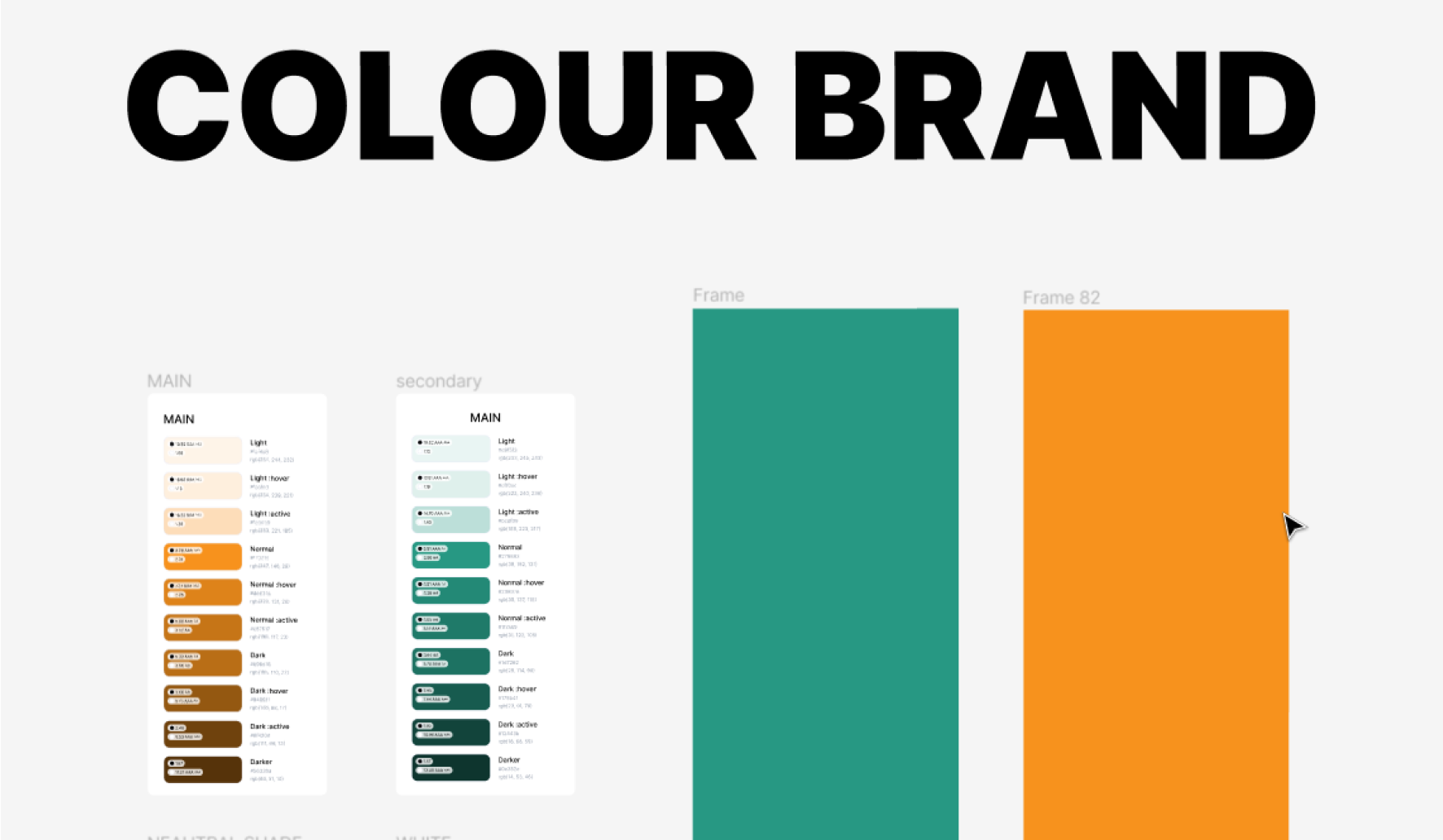
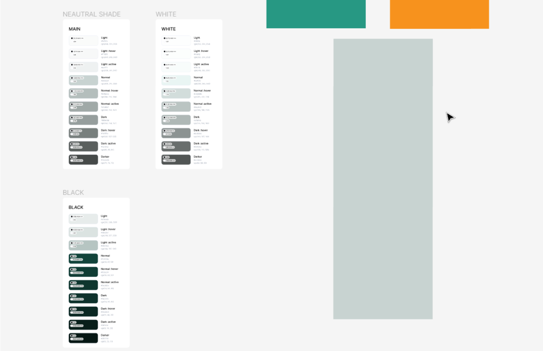
BRAND COLOUR / COLOUR PALLETE
The company's designated colors, "279883" and "F7921D," held immense importance as they were specifically selected by the company and its logo designer. Our task was to ingeniously leverage these captivating colors in the app's design, allowing its user interface (UI) to make a lasting impression and stand out from the crowd.
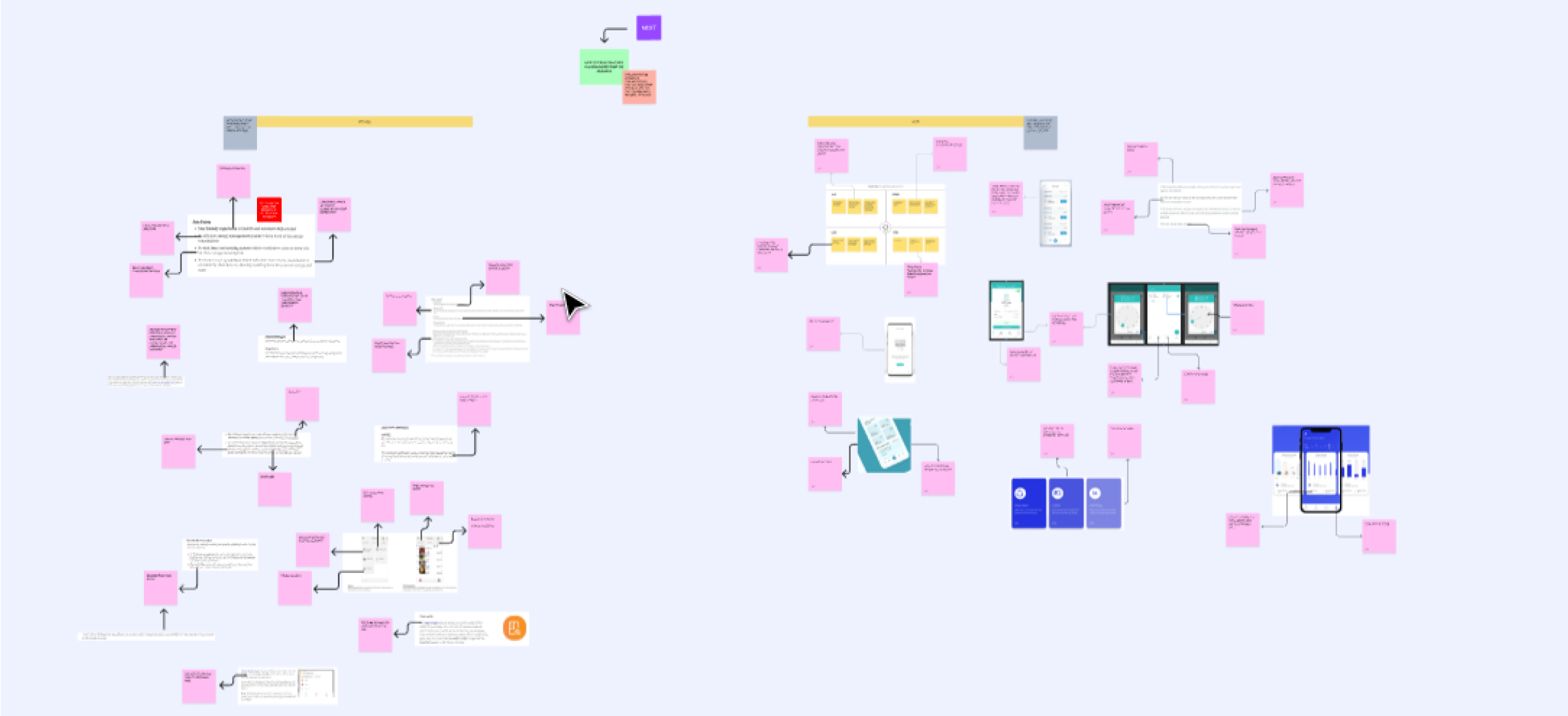
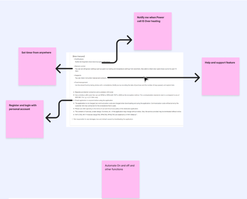
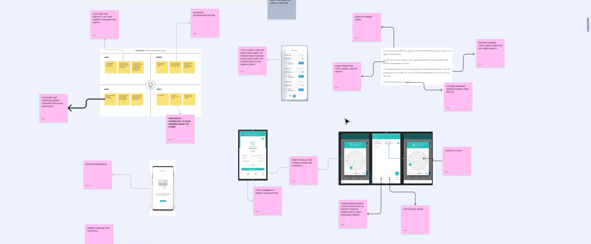
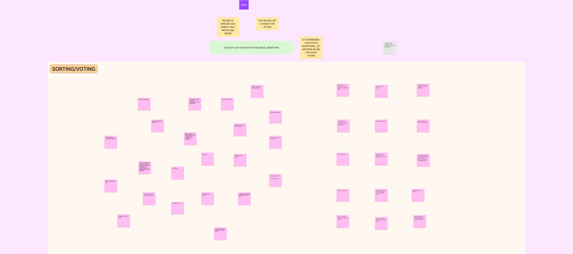
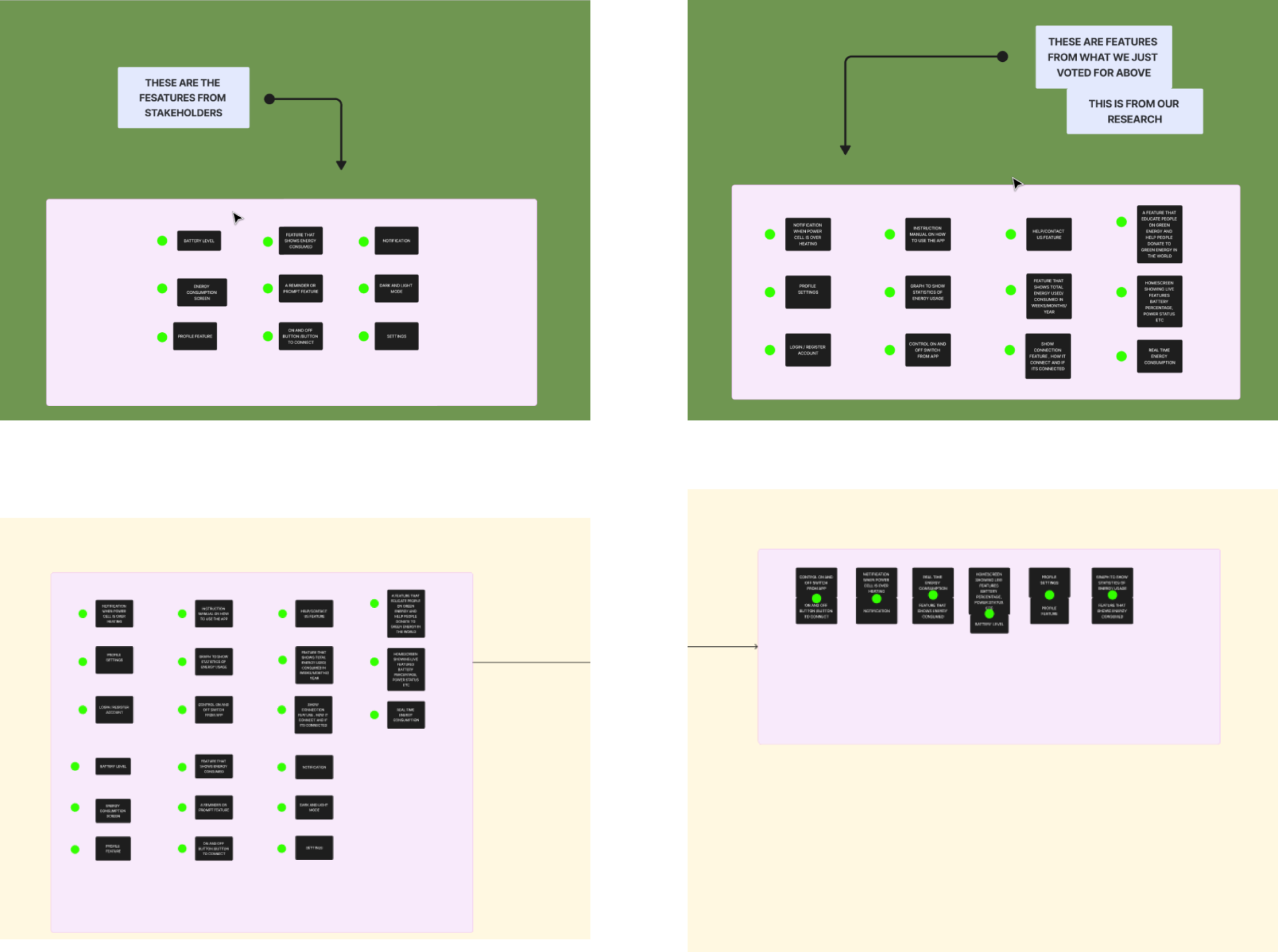
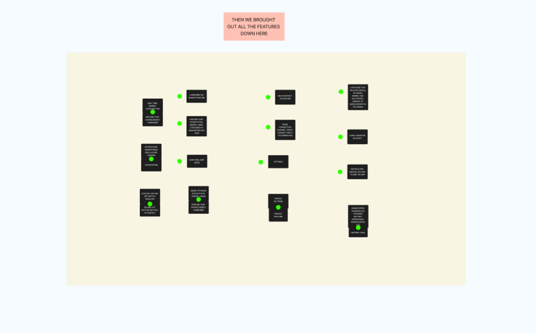
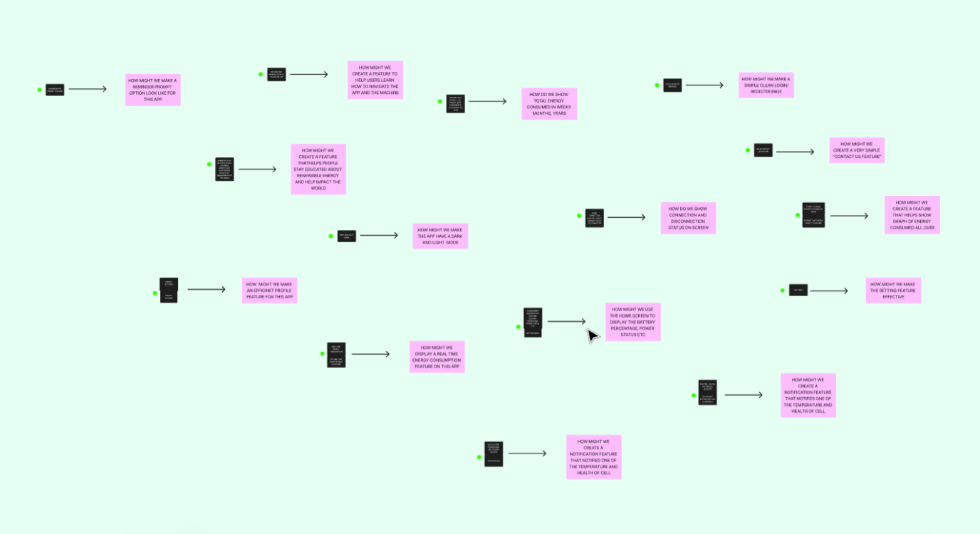
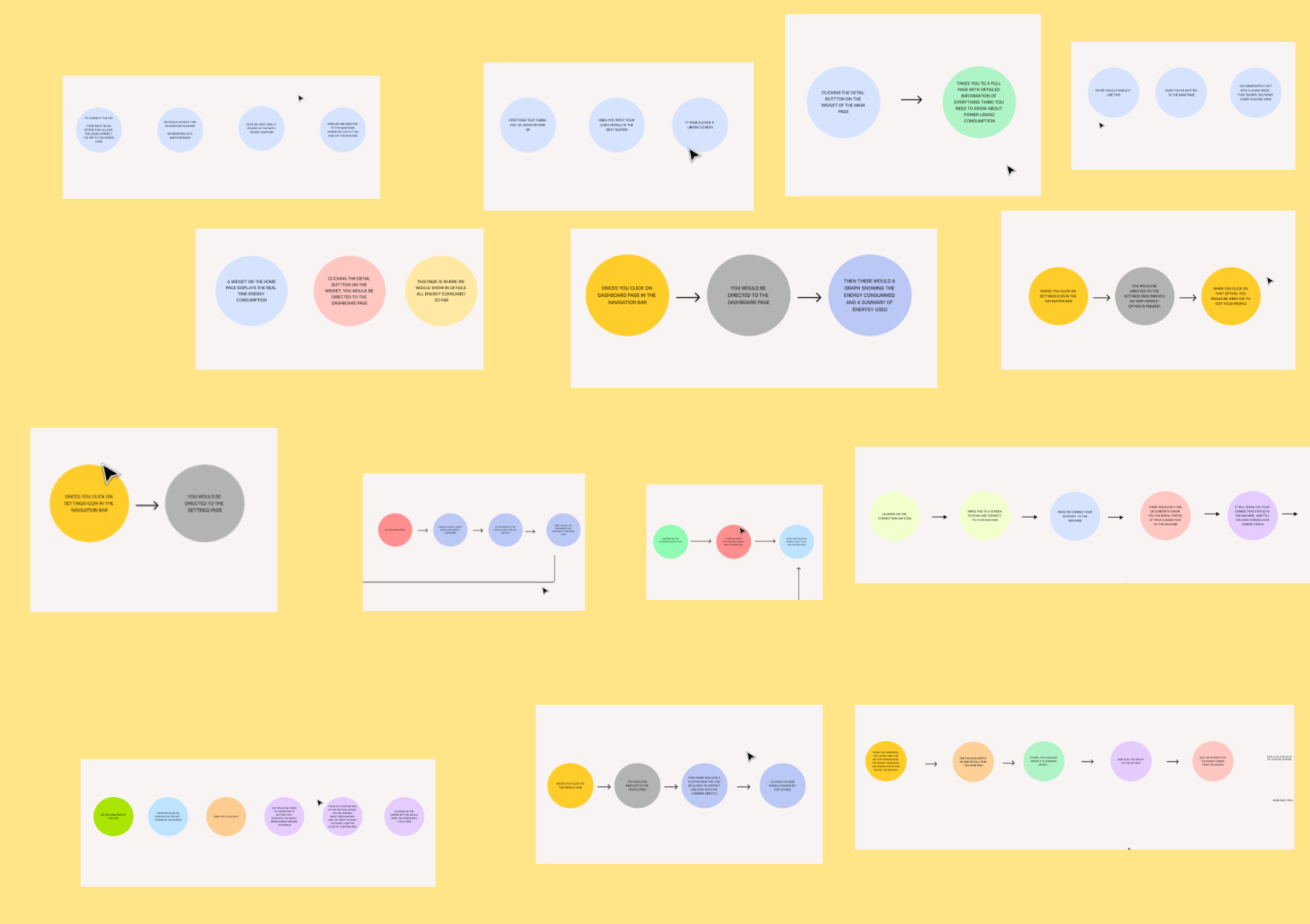
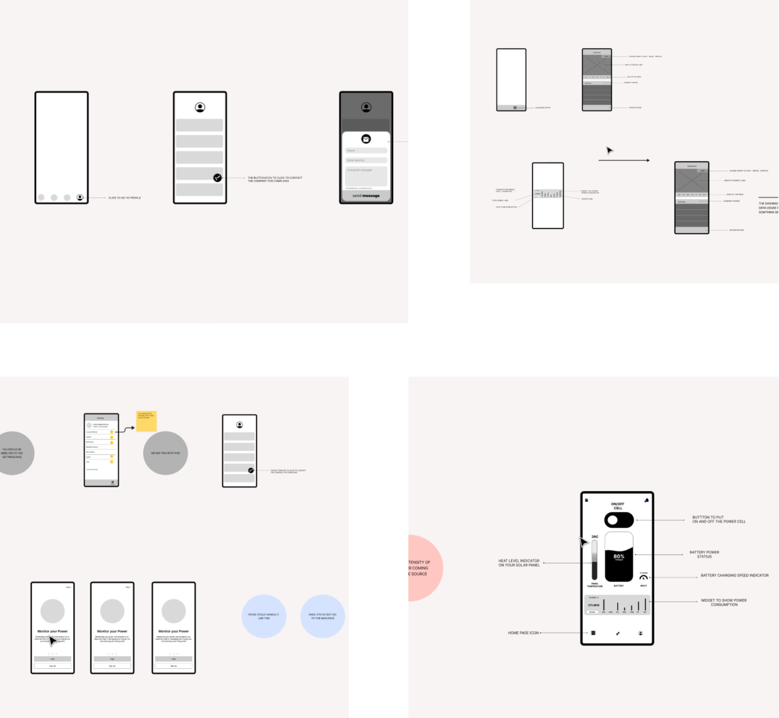
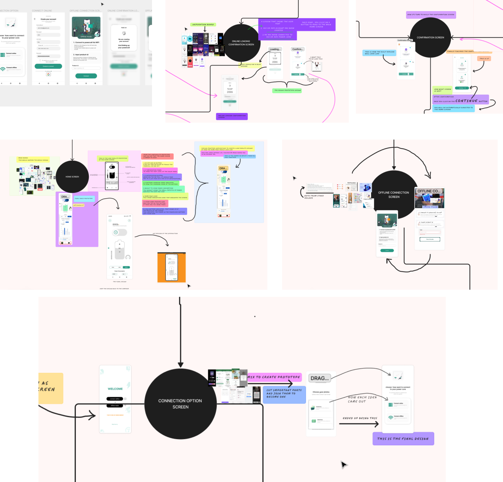
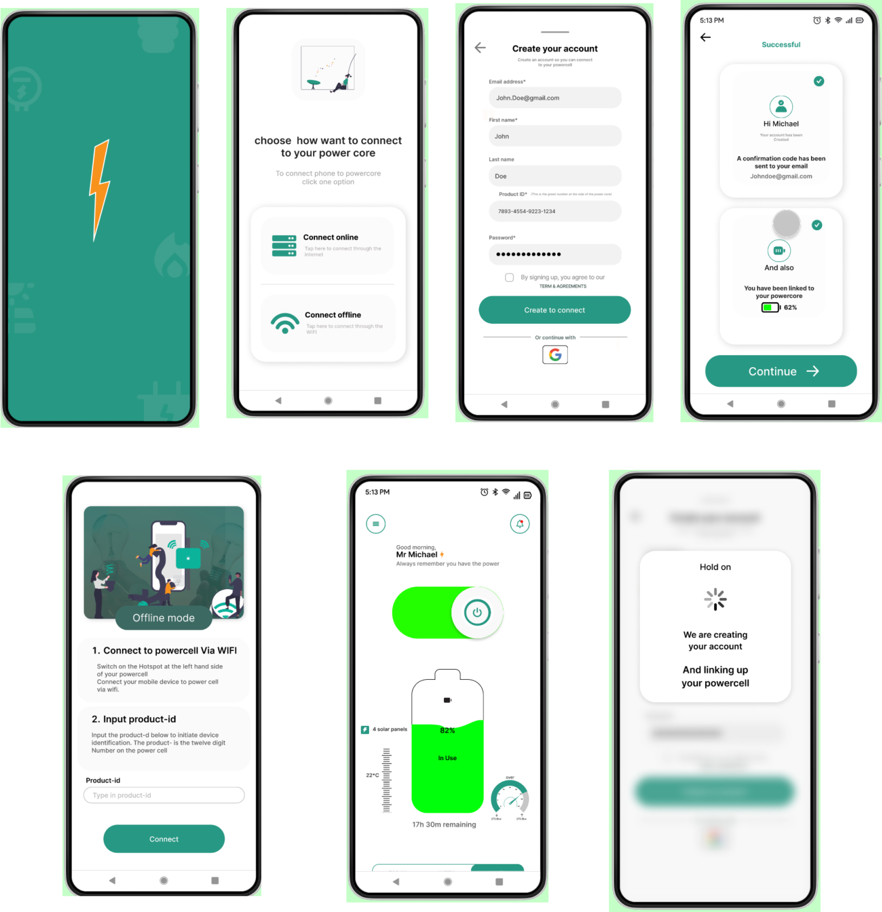
BUILDING AND ITERATIONS
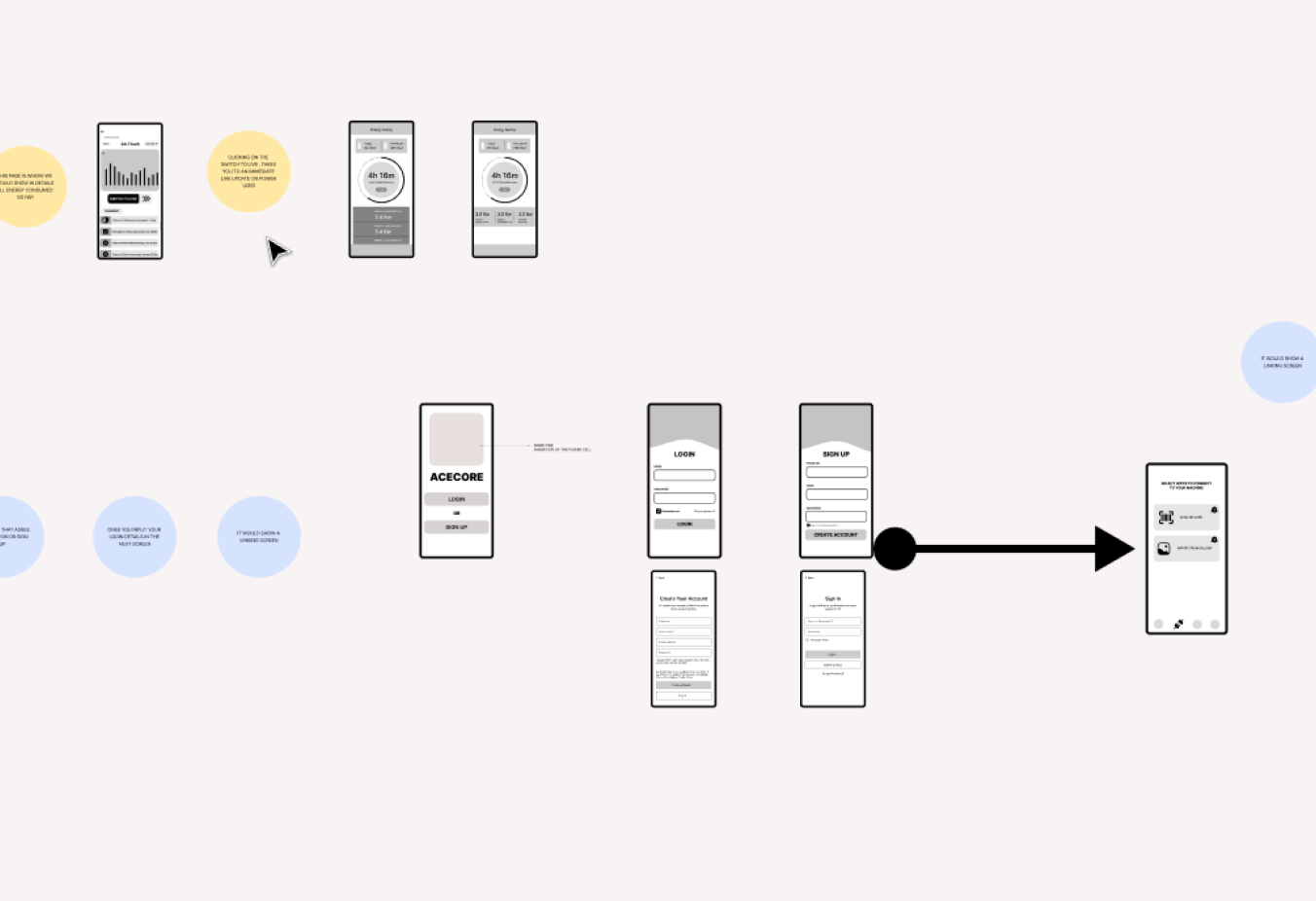
BACK AND FORTH ITERATIONS
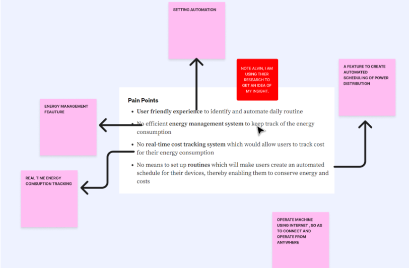
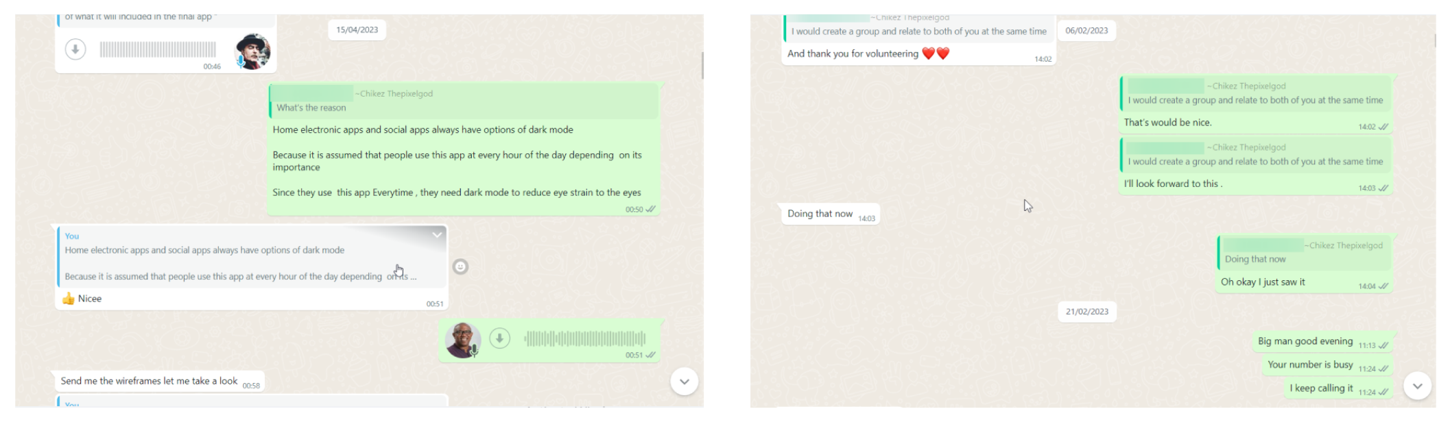
Designing a perfect solution is an iterative process that involves continuous refinement. We actively engaged in a series of interactions, incorporating feedback, implementing changes, and introducing new elements and structures. Multiple meetings were conducted to ensure that the final design effectively met the product requirements and aligned with the business objectives. In our quest for excellence, we utilized various tools, including journey maps, user flows, and identified pain points, to uncover valuable insights and fine-tune the designs for optimal performance.
FUTURE/FINAL OUTCOME
There is a well-known saying that states, "A good design is never truly finished; there is always room for improvement." This holds true, as there will be future iterations to enhance various aspects of this mobile app's design. However, for the purpose of this presentation, the designs presented here represent the final versions submitted to the stakeholders. We dedicated our efforts to addressing the issues in the previous UI designs and refining the onboarding flow. Moreover, we implemented new design systems and replaced the old architecture with an improved one. Please find the updated designs below.
HAND OFF TO STAKEHOLDER
Finally, the designs were handed off for development. Since the stakeholders were actively involved throughout the design process, the final outcome did not come as a significant surprise to them. They were highly satisfied with the final designs and expressed great enthusiasm to proceed with the product development phase. The necessary handoff procedures were completed, and the project was approaching its final stages.
KEY TAKEAWAYS, LEARNINGS, AND INSIGHTS
COMMUNICATION IS THE KEY
Through comprehensive user surveys and interviews, it became clear that communication emerged as the most crucial element for the success of the user experience. Keeping this in mind, the primary focus should be on creating a tangible solution that effectively addresses the needs and requirements of all users.
SET REALISTIC EXPECTATIONS AND DEADLINES FOR EVERY PROJECT
Throughout the scoping process, our team aimed to include a multitude of features on the home screen. However, upon closer evaluation, we recognized that the majority of these features were impractical and unfeasible for both our users and developers. This experience served as a valuable lesson, reminding me of the significance of delivering genuine value in our project. It also underscored the importance of designing solutions that were not only innovative but also within the realm of feasibility for our development team.